Recipe Research
My Recipe
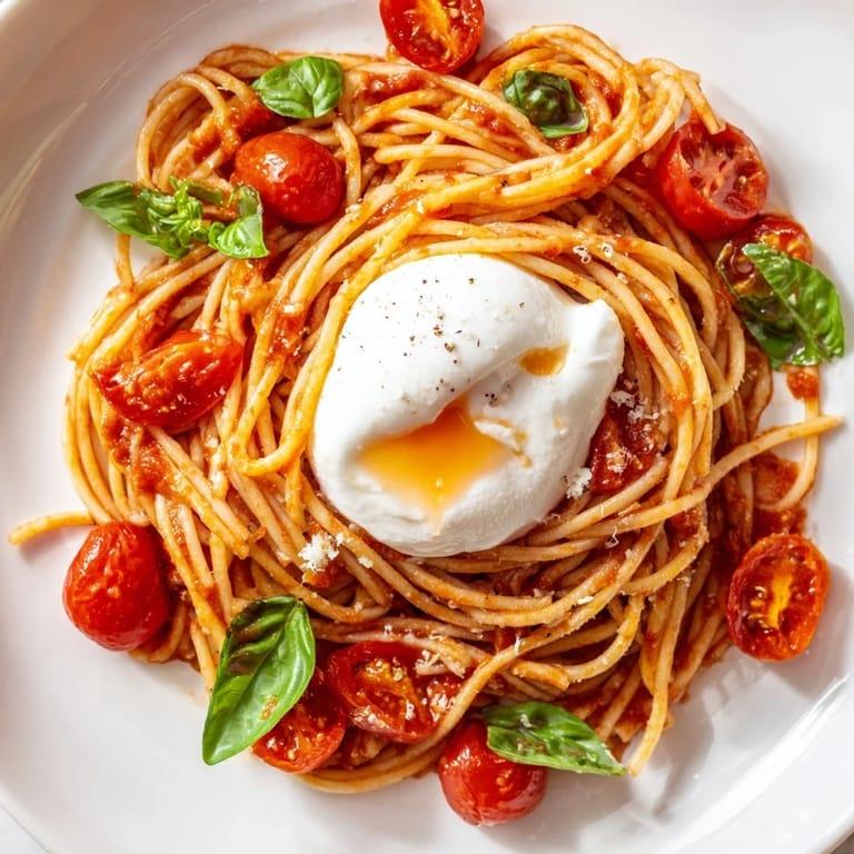
Miso Tomato Burrata Pasta
This miso tomato burrata pasta is a simple pasta dish made with
cherry tomatoes, shallot, garlic, and miso paste. The tomatoes
create a rich and savory sauce while the burrata adds a creamy
finish. This recipe serves one person.
Ingredients
- 1 shallot
- 3 cloves garlic
- 1 box cherry tomatoes
- 1 ball burrata
- Spaghettini, or pasta shape of choice
- Miso paste
- Salt
- Black pepper
- Garlic powder
- Chilli flakes
- Rosemary
Instructions
-
Bring a pot of salted water to boil and cook the pasta
according to the package instructions.
-
While the pasta cooks, finely chop the shallot and garlic
and cut the cherry tomatoes in half.
-
Add the shallot and garlic to a pan and cook until softened
and fragrant.
-
Cook the tomatoes until they soften and begin to break down
into a sauce.
-
Stir in the miso paste and a small amount of pasta water.
Mix until the miso is incorporated into the tomato sauce.
-
Add the cooked pasta to the pan and toss until the pasta is
completely coated in the sauce. Add more pasta water if needed.
-
Transfer the pasta to a bowl and place the burrata on top.
Finish with additional black pepper, chili flakes, or rosemary
if desired.
Source:
TikTok recipe by @j8c1yn
Recipe Website References
Bon Appétit is a useful reference because it uses large food
photography and strong typography to make its recipes visually
appealing. I especially like how the photography attracts attention
while the recipe information is still organized and easy to read.
NYT Cooking is a good reference because its recipe pages have a
clear visual hierarchy and keep the information easy to scan.
I like the separation between the recipe title, description,
ingredients, and instructions, which could help organize my own page.
Food52 is a useful reference because its recipes have an editorial
and lifestyle-oriented appearance. I like the balance of photography,
typography, and white space because the page feels designed without
making the recipe difficult to follow.
Non-Recipe Website References
I like Kinfolk's minimal editorial style and its use of large
photography with a lot of open space. I could use a similar approach
to make food photography the main visual focus of my recipe page.
I like Aesop's restrained typography and neutral visual style.
A similar approach could keep my recipe page simple and sophisticated
while allowing the natural colors of the dish to stand out.
I like the way Pentagram uses strong typography, imagery, and
structured layouts to create clear visual hierarchy. I could use
similar ideas to distinguish the recipe title, ingredients,
instructions, and supporting images on my page.